If you’ve used Adobe Illustrator for any amount of time, you’ve probably created a complicated piece of artwork. Those files can be fairly large, making file transfer and storage cumbersome. Thankfully there’s a simple way to drastically reduce your file sizes.
When saving your files, choose the native AI format. This offers you the most flexibility, and the ability to reduce the files. You’ll also want to tick the Create PDF Compatible File box. This allows Illustrator to recover the file should the program crash.

In the Illustrator Options dialog box that pops up, tick the Use Compression box. That’s it! Instant smaller files.
Now you may have guessed that ticking that PDF Compatible File box also adds some overhead to the file, so if you’re looking for the smallest file size possible, go ahead and uncheck the box.
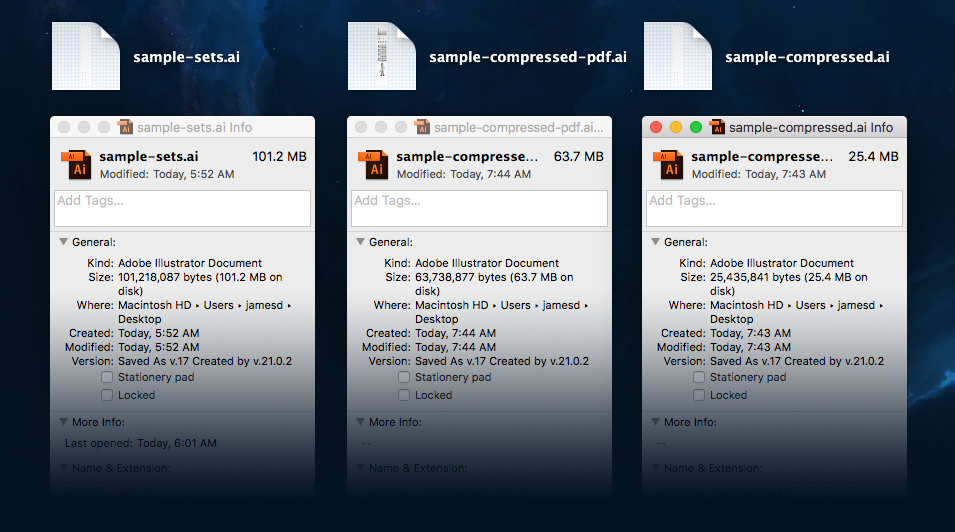
As you can see in the image above, the original Illustrator file weighs-in at 101.2 MB. Saving the file with PDF Compatibility and Compression reduces the file to 63.7 MB. Unchecking the PDF Compatibility box reduces the file even further to 25.4 MB in size.
That’s a big savings!