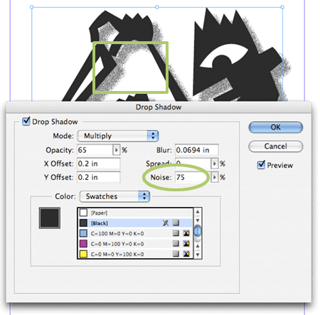
If you’ve upgraded to InDesign CS2, and you use drop shadows, you have have noticed a new feature in the drop shadow dialog box. It’s called Noise. To understand how valuable this addition is, take a look at a piece you’ve done with drop shadows on a white background, or a solid color background. Notice any banding? Does the shadow not “blend” with the background? Does it ever look like the drop shadow is simply another colored object? Enter Noise. What adding Noise does to your drop shadow is it breaks up the drop shadow color into random dots, rather than a smooth gradient of color. Between using Multiply and adding Noise, your drop shadows should look much more natural, and blend much better with background colors.

Getting better drop shadows in InDesign
