If you enjoy Leopard’s new Mail Stationery for sending beautiful HTML email, but wished you could personalize it more, read on for some very good news!Apple has made Mail’s new Stationery feature quite easy to edit to your heart’s content, as long as you have an image editor that can save .jpg and .png files, and an HTML editor such as Dreamweaver (or just text edit if you’re a die-hard HTML coder). Just follow these simple steps:
How to create customized OSX Mail stationery in Leopard
Keep layers intact when copy & pasting objects from one InDesign document to another
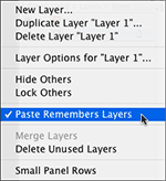 Moving objects from on InDesign document to another is as easy as drag-and-drop or copy-and-paste. But what about when your Indesign document contains items on multiple layers and you don’t want to lose them when you move the objects to another document? By default, InDesign merges all the objects when pasting in a new document onto the default layer. InDesign has a simple solution for this earth-shattering dilemma. Simply visit the Layers Panel flyout menu and select Paste Remember Layers. This will keep the objects you’re copying on their respective layers through the copy process.
How to match colors in multiple photos in Photoshop
When faced with the task of taking part of one photo and blending it with another photo, you may run into the problem of color variances that make it obvious that one of the photos doesn’t “belong.” 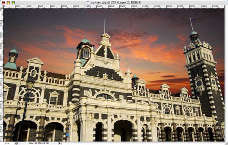 For instance, I want to take a photo of a building which was photographed in mid-day and drop it into a sunset photo. Obviously the photo of the building will look out of place due to the time of day the photos were taken. See the image above for what I mean, the building looks out of place. Fortunately, there’s an easy solution.
 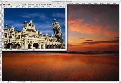 Step 1: Open both your images in Photoshop and make sure both are in RGB color format (CMYK won’t work). Make sure that the image you wish to alter is selected and in front. In this case, I want to alter the building photo to look like it was taken at the same time as the sunset photo, so the building image is in front. See the image above. Step 2: Visit the menu bar and select Image>Adjustments>Match Color… The Match Color dialog box will open and you will be presented with several options. The first thing you want to do is go down to the Image Statistics section and select the Source image from the drop-down menu, in this case it is the sunset.jpg. This can be confusing because the preview shows the image you’re working on, not the source image. See the image below.
 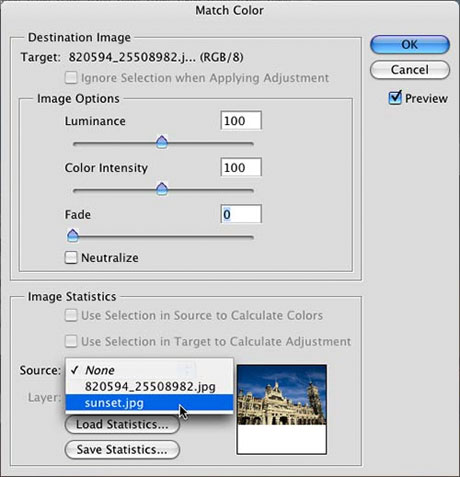 Step 3: You will notice that your working image is now using the colors and tones from the source image. Now you can play with the Image Options in the upper part of the Match Color dialog box. See the image above. Move the Fade slider around to adjust the tone of the colors, and adjust the Color Intensity as well. Once you’re happy with the adjustments, hit OK. As you can see in the image below, the building image is looking better already.
 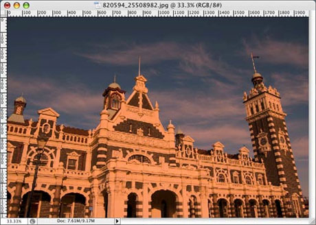 Step 4: Now simply copy the portion of the image you wish to place into the source image. In this case, I created a selection of the building before hand, so I’m just selecting the building, copy and pasting it into the photo of the sunset.
 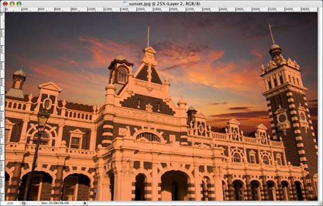 Step 5: You may have to cleanup some of the rough edges of your selection, but that’s it. As you can see in the image above, the building looks more at home in the sunset photo than it did in the first image of this tutorial.
Create a halftone-dot effect in Adobe Illustrator
A while back I posted a link that would show you how to create an interesting halftone-dot effect in Photoshop. Recently, a reader left a comment on the post asking if there was a way to achieve the same effect in Illustrator. I’m happy to report that there is, and I’ve put together a tutorial to show you how.  Step 1: Create a shape in Illustrator that you wish to convert into the halftone-dot effect. I chose a star. To achieve the mixed-size dots, you’ll want to use a gradient, and to make it easy later, you should probably start with a simple black color. Step 2: Select the object and select Effect>Pixelate>Color Halftone… from the menu. The color halftone dialog box will open where you can enter some numbers to adjust the appearance of the effect.
  Set the Max. Radius to 10-15 pixels. This will determine the size of the largest dot in the effect. Go ahead and leave the screen angles at the default setting. Hit OK. The star is now converted to a raster image. The darkest areas of the star have the largest dots, and the lightest areas have smaller dots. We are now half way there. We need to convert the raster image to vector. Step 3: With the star still selected, go to Object>Expand Appearance in the menu. Now select Object>Live Trace>Make and Expand from the menu. The star is now a full vector object. You can select each dot individually if you choose because they’re all vector shapes (see step 3 in the image above). But you probably want to add some color.
  Step 4: If the star is on a white background, everything will appear to be perfect. But draw a box, fill it with color and send it to the back by hitting Command-Shift-[. You’ll notice that the inside of the star remains white. If you want it to be transparent, you have just a bit more work to do. See the image at the right for an example of what I’m talking about. Use your Direct Select tool (the white arrow) to select any white are in the newly created halftone dot area. Go to Select>Same>Fill Color in the menu. Now that all the white areas are selected (including the white bounding box around the star, hit Delete. You should be left with nothing but the dots now. Now select the star again and add a color to it as you would any other object. Because the star is a compound path, all the dots will be colorized. That’s it. You have your halftone-dot effect, and it’s a fully-editable vector object in Illustrator. Why would you want to do it in Illustrator? Because many sign shops and screen printers require everything to be a vector shape depending on their production methods. Plus, it adds a little more flexibility for later editing.
 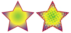 I chose to use a one color object for the sake of keeping this tutorial simple, but you can apply the same technique to a full color object for different results. See the image above with the same star filled with a color gradient.
PDF font subsetting explained
I’m often asked about Font Subsetting when exporting and creating PDF files using Distiller or directly from InDesign, so I thought I would post this explanation of what Font Subsetting is. When generating a PDF, it is possible to include only those characters in a font that were used in the document. This partial font is called a “Font Subset”. You adjust font subsetting in either the Acrobat Distiller job options or InDesign’s export dialog under “Subset fonts below X%”. The percent represents how much of the font is used in your document before it gets embedded in the PDF file. So a setting of 100% would mean that the entire font would be subsetted in the PDF file, while a setting of 5% would mean that you would have to use nearly all the characters available before the font would be subsetted. The primary advantages of subsetting fonts are that it not only reduces the PDF file size, but RIP’s (raster image processors) are forced to use the subset font even if the system has the full font available. Your PDF is slightly larger than other PDF files, but is also less likely to have problems with substituted fonts when output. Disadvantages of font subsetting are that it prevents your output provider from making edits to the PDF file if necessary, while still maintaining font integrity.

