LogoLounge offers a look at current logo trends for 2008, including emphasis on vivid colors and cleanliness.  I have to say that I’m happy to see the glassy bubble look disappearing from a year or two ago, and the trend of putting a green leaf in your logo seems to also be passing.
Logo Lounge: Current logo trends for 2008
Select all the objects on an Illustrator layer with one click
![]() If you build extremely complex files in Adobe Illustrator, you’re most likely smart enough to build your files carefully using the layers feature. Building your file using layers not only helps you stay organized, but it makes it so much easier to edit your files later. It’s not out of the ordinary for me to have 5 to 10 different layers in an Illustrator file, so this tip comes in very handy. To select all the objects on any layer, simply Option + Click on the layer name (not the layer icon) in the Layers panel.
If you build extremely complex files in Adobe Illustrator, you’re most likely smart enough to build your files carefully using the layers feature. Building your file using layers not only helps you stay organized, but it makes it so much easier to edit your files later. It’s not out of the ordinary for me to have 5 to 10 different layers in an Illustrator file, so this tip comes in very handy. To select all the objects on any layer, simply Option + Click on the layer name (not the layer icon) in the Layers panel.
Eliminate shadows in Leopard screenshots
In the last few months one of my favorite sites, CreativeTechs‘ QuickTips, has blogged two of my previous articles (Easily remove an OSX System Preference Pane, and Copy multiple Photoshop layers into a new document without flattening). Today I’m happy to return the favor with this tip from CreativeTechs on eliminating shadows you get when using Command + Shift + 4 in Leopard screenshots. To do it, simply fire up OSX’s Terminal application (located in Applications/Utilities) and enter the following:
defaults write com.apple.screencapture disable-shadow -bool true
Then logout and log back in, or restart. Your screenshots should now be void of shadows. 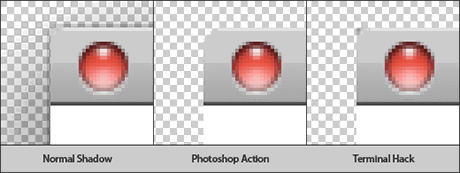 As noted in the CreativeTechs article, this method works well. But for the really picky designer, the artifacts left around the rounded corners of windows (as seen above) can be a real nuisance. Be sure to check out the link at the bottom of the article that will make a Photoshop Action available which gets rid of the Leopard shadow, and replaces it with a custom layer style which you can turn on and off as you wish. By the way, if you wish to set the shadow defaults back to normal, you can do so by opening the Terminal again and entering the following:
defaults delete com.apple.screencapture disable-shadow
Happy shadow hacking!
Isolate your grouped objects for editing in Adobe Illustrator
Adobe Illustrator CS3 offers users a convenient way to edit grouped objects called Isolation Mode. In previous versions, in order to work on an object that was grouped with other objects, you would have to switch to the Direct Selection tool (white arrow), and then contend with trying to see just the path of the object you want to work on mixed among all the other paths. 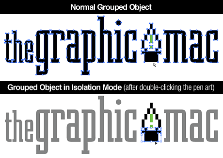 Isolation Mode allows you to double click an object you wish to work on which is grouped with other objects, and edit it as if it were no longer grouped. The advantage is that Illustrator doesn’t actually ungroup the objects, it just isolates them for you. It also offers the added advantage of fading out the other objects in the document to make it easier on the eyes. To exit Isolation Mode, simply right click (Control click) on the page and select Exit Isolated Group.
10 keys to a better presentation (just like Steve Jobs)
Carmine Gallo has written an excellent article over at BusinessWeek titled Deliver a presentation like Steve Jobs that’s an excellent read for anyone working for an ad agency or who regularly gives presentations to potential clients. In my past experience with giving presentations, I always felt that the keys to a successful presentation were in how it was delivered. NOBODY will be excited at viewing slide after slide of a text-filled PowerPoint – or even worse, listening to someone who is simply reading the text-filled slides to them as though they’re stupid and can’t read for themselves. A successful presentation is reliant on an exciting, enthusiastic presenter delivering the information in a clear manner, not spinning, fading, dancing charts and headlines on a screen. Use your PowerPoint slides as a highlight, or introduction to what you’re going to say. When presenting your creative to potential clients, never, ever, EVER present them on a PowerPoint slide. Always print them out large and mount them to presentation boards. Your work is probably what’s going to close the deal, so make sure it look the best it can. And finally, practice makes perfect. Make sure you’re completely comfortable with what you’re going to say and show. If you’re at ease, so will your client be.
Think before your rip-off other designer’s work – especially Panic Software!
Thinking of using Panic Software’s Transmit icon for your Web project? Think again.  Panic has put together a page on their site showcasing all the latest Web designer’s who have blatantly ripped-off their work, most notably their Transmit icon. What’s amazing is not that these designers have ripped-off the icon for their own use, it’s that in many cases, they didn’t even bother to remove the Panic icon from the side of the Transmit truck. I don’t know if Panic has taken legal action against any of these design “hacks,” but cheers to them for keeping a good sense of humor about it!
Quickly changing the ruler units setting in Adobe Illustrator
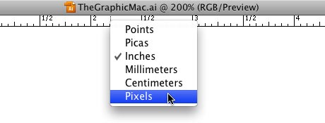 If your preferences are set to show the ruler units in Inches in Adobe Illustrator and you happen to be working on a Web graphic, you can quickly change them to pixels (or several other measurement units) by right-clicking (Control + Click for one-button mouse users) on the ruler and selecting Pixels from the drop-down menu. I can see the use for Points, but does anyone actually use Picas anymore?
Create a comic book halftone-dot effect for your Photoshop images
If you’ve got a particularly “uninteresting” image you want to use in your next design project and you’re looking for a way to spice it up a bit, consider adding a comic book style halftone-dot effect to your image. It’s quick and easy, uses only Photoshop’s built-in filters, and produces excellent results.
1. Choose your image.
Images with a decent amount of contrast and midtones work best, but virtually any image will do the trick. I chose this handsome little fella: 
2. Duplicate the image.
Select the background layer from the layers panel and hit Command + J (or drag the layer icon to the new layer icon at the bottom of the layers panel) to duplicate the image layer. Label the new layer “Comic effect” or something meaningful.
3. Prepare for the filter
![]() Make sure the newly created Comic effect layer is on top of the original layer (if you left the original layer set as “background” you should be good to go). Now hit the “D” key to reset your colors to solid black & solid white. Then hit the “X” key to invert them so white is the foreground color and black is the background color.
Make sure the newly created Comic effect layer is on top of the original layer (if you left the original layer set as “background” you should be good to go). Now hit the “D” key to reset your colors to solid black & solid white. Then hit the “X” key to invert them so white is the foreground color and black is the background color.
4. Apply filter
With the Comic effect layer selected, go to your menubar and select Filter>Sketch>Halftone Pattern. For now, just leave the settings at their default, which is usually: Halftone Pattern Size: 1 Contrast: 5 Pattern Type: Dot Hit OK. Your image should now look something like this: 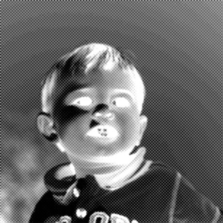
5. Invert the image
With the Comic effect layer still selected, hit Command + i to invert the image. It should now look something like this:  If we wanted to have a black & white image, we could probably stop here, but I want color, so let’s move on.
6. Adjust the blending mode
Go to your layers panel blending mode drop-down menu and select Linear Light. You can try any of the other blending methods, but I’ve found that Linear Light works with the most predictable results and requires less tweaking. Your image should now look something like this: 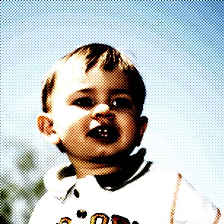 The image is too “muddy” like it is, so we have one last adjustment to make.
7. Set the opacity
With the Comic effect layer still selected, adjust the opacity to your liking. For this image, I chose a setting of about 60%, but it really depends on the image.
Final Image:
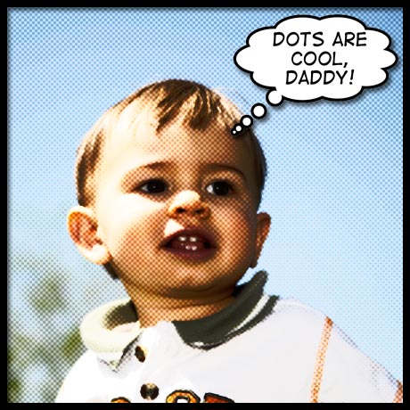 I added a thick black comic-style border, and a thought balloon with a comic-style font to complete the theme. There are several variations of this technique, but I’ve found that just playing around with the filter settings and layer blending modes can produce a wide-variety of effects by themselves. For instance, in the Halftone Filter settings from step 3, you could choose Line instead of Dot. Play around with it and see what you can come up with.

