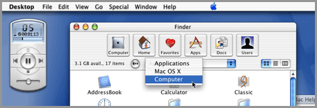
Since around 1986, Apple’s Mac Operating System has won-over users due to its ease of use, simplicity and the fact that not much changed in the way it worked — a fact that many PC users claimed was a fault. In fact, until OSX was release in March of 2001, about the biggest thing that changed with the way the Mac OS looked and worked was a few Control Panels making connecting to the Internet easier and a handful of doo-dads that were easily missed unless you were looking for them. All the Finder windows, keyboard commands and icons remained relatively unchanged for years.  With OSX, everything changed. Users cried foul, threatened to leave the platform if Apple didn’t immediately remove the candy icons and buttons and go back to the dull grayscale and relatively flat appearance of OS9. Of course, eventually those users came-around and quickly learned to love OSX. From OSX 10.1 PUMA to 10.4 Tiger, not much changed with the overall appearance of the Mac OS. A few cool new apps like iChat, a brushed metal appearance, iTunes, iMovie, iDVD, Mail and Safari came along, but none of those really fundamentally changed the way we work with the OS. But then came along a big, bad cat named Leopard.
  With the recent release of OSX 10.5 Leopard, a whole new way of looking at Apple’s idea of what the OS should be began to creep into my head. The Dock changed, and in most people’s opinion, not for the better. Suddenly the easy to navigate folders turned into Stacks… of worthless garbage, no less. The clear and simple GUI was replaced with space-age desktops, 3D Dock, and Finder windows that featured Cover Flow — a feature that is so poorly implemented that I find it 100% useless and a nuisance just having it there. Don’t get me wrong, it’s a nice idea, and could potentially be very useful, were it not for the fact that when switching to Cover Flow your list of files only takes up a tiny portion of the window. I find myself having to resize the window, then move the divider bar up so that the Cover Flow are only takes up the top 1/3 of the window every time I want to use it. Baaahhh, fogettaboutit!
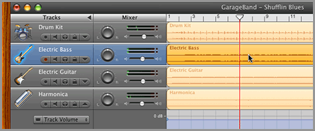
  At least Apple finally settled on a GUI theme for most of the OS. Having Aqua and brushed metal existing at the same time was just plain annoying. Oh, wait a minute. The more I think about it, Apple hasn’t settled on a GUI just yet. With 10.5 we got rid of the brushed metal, but now we have these semi-transparent black windows popping up all over the place, and a transparent menu bar that annoys most users to no end. And what the heck is STILL with Garage Band? Did Steve Jobs lose a bet or something? Don’t even get me started on why the OS (and most every app that runs on it) has Aqua-style scroll bars, and iTunes has darker, more flat graphite looking scroll bars. Personally, I like the iTunes style, but I really don’t care either way — I just want them to choose ONE! Then there’s iMovie. What was once a simple yet powerful movie editor turned into… well, a really simple and not as powerful movie editor. At least, in most people’s opinion. The fact is, Apple has made it quite difficult to figure out if they took away features or simply moved them around a bit. Then there’s iTunes. With a name like iTunes, you would expect that the application plays music. Obviously it does, and up until recently it did it extremely well with little interference from other functions of the OS. But then came iPhone. Now, iTunes is used not only to organize and play your music, but handle your video, create ringtones, sync your Mail and update software as well. Huh?
 ![]() And what of our simple little Instant Messenger, iChat? It used to be just that… simple. Now, we can also conduct audio and video conferencing, as well as transfer files and completely take over another Mac at the touch of a button. Shouldn’t that have been a separate application? Oh wait, it is. It’s called Apple Remote Desktop, or if you don’t want to pay for ARD, the Finder. Remember when an email app was for reading email, and a Web browser was for surfing the Web? I do, it was back in OSX 10.3. But then Apple added the ability to handle RSS feeds into Safari. Ok, so that wasn’t too bad, they’re similar in function and fit well together — though the way Apple implemented it is so woefully under-featured that I find it unusable. Instead of stopping there and improving it, they added RSS into Mail as well. Now which is it Apple? Should I be reading RSS feeds in my browser or my email app? I have an idea, why not create a stand-alone RSS reader that’s easy to use and has at least some of the basic features one would expect to find in an RSS reader, rather than the half-baked attempt we currently have in Leopard. Well, now that NetNewsWire is free, I suppose there’s no point. Speaking of Mail and integrating features and functions. Why not do the sensible thing and merge iCal, Address Book and Mail? At least that would make sense for most users who are used to either Outlook on a PC or Entourage on the Mac… you know, business users. Apple added Notes and a To-Do List to Mail, but both are what I would consider “bare minimum” as far as how they work. Adding iCal and Address Book to Mail would most likely result in the same, I fear.
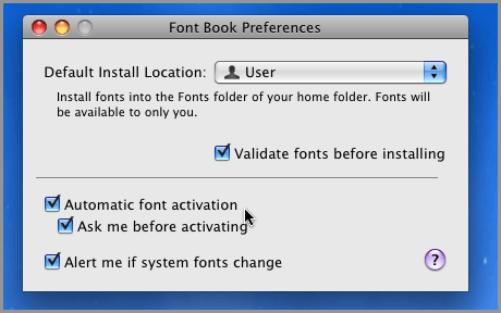
And what of our simple little Instant Messenger, iChat? It used to be just that… simple. Now, we can also conduct audio and video conferencing, as well as transfer files and completely take over another Mac at the touch of a button. Shouldn’t that have been a separate application? Oh wait, it is. It’s called Apple Remote Desktop, or if you don’t want to pay for ARD, the Finder. Remember when an email app was for reading email, and a Web browser was for surfing the Web? I do, it was back in OSX 10.3. But then Apple added the ability to handle RSS feeds into Safari. Ok, so that wasn’t too bad, they’re similar in function and fit well together — though the way Apple implemented it is so woefully under-featured that I find it unusable. Instead of stopping there and improving it, they added RSS into Mail as well. Now which is it Apple? Should I be reading RSS feeds in my browser or my email app? I have an idea, why not create a stand-alone RSS reader that’s easy to use and has at least some of the basic features one would expect to find in an RSS reader, rather than the half-baked attempt we currently have in Leopard. Well, now that NetNewsWire is free, I suppose there’s no point. Speaking of Mail and integrating features and functions. Why not do the sensible thing and merge iCal, Address Book and Mail? At least that would make sense for most users who are used to either Outlook on a PC or Entourage on the Mac… you know, business users. Apple added Notes and a To-Do List to Mail, but both are what I would consider “bare minimum” as far as how they work. Adding iCal and Address Book to Mail would most likely result in the same, I fear.  Professional designers look at Apple’ Font Book in Leopard and wonder why Apple didn’t “finish the job.” They finally added auto-activation, but it apparently works only when it wants to, and only in the apps it chooses on any particular day. I say that because while I’ve gotten auto-activation to work with Adobe InDesign CS3 a few times, I can’t seem to find another person in my half of the world that has. Font Book is certainly more robust and stable than it was in the past, but it’s just not where it needs to be yet. It’s almost like they just gave up halfway through development. Based on what we have now, I can’t for the life of me figure out why they don’t go the extra mile and blow the doors off Extensis and Insider Software’s font management apps and put us all out of our font management misery. And for cryin’ out loud, stop making your own version of Helvetica and Futura the default fonts! Print designers are going crazy trying to figure out how to deactivate the Apple-provided version in favor of their own Postscript versions. If you insist on using Helvetica and Futura, could you please not install 5,321 copies of it on my Mac! When I look at the sweeping and abrupt changes Apple has been making to the OS and the iApps the last year or two, I almost feel like they’re becoming Microsoft. Code being tossed around, shoe-horned in and tested by folks who obviously don’t actually use the features they’re testing on a daily basis. Some features just seem like an after-thought. Still more are just plain bad (iWeb anyone?). Don’t get me wrong, I think the Mac OS is still far-and-away the best OS available. The features are far superior and easier to use than anything Microsoft or Linux distros have to offer. And I have no intention on switching any time soon. For 80% of what I do, the Mac is just better than the other OS options. The problem is, it used to be 95% better than all the other options. With the pressure to innovate and come up with new bells and whistles with each major OS update, I fear that Apple is falling into the trap of never perfecting anything. Users of Windows Vista know what I’m talking about, and I would hate for Apple to fall into the same trap, and end up with the same results. New features are great as long as the old ones have long-since been fixed and run smoothly. But adding frivolous features for the sake of saying “it’s in there” causes nothing but confusion and frustration. Please Apple, for the love of all things good and right in the world, make sure the next OS update is crisp and juicy, with no worms — the way our Apple should be. Note: MacWorld 2008 starts today, with an update to Leopard heavily rumored. We shall see if Apple has listened to all the griping about bugs, the Dock, Stacks and more. Please Digg this article if you like it.
