When you want a set group of colors to be available to you every time you create a new Adobe InDesign document, simply close all open ID documents, then create any colors you want to be “always available” in the Color palette. Now, whenever you create a new document, those colors will be available. It should be noted that this tip works exactly the same in Quark XPress.
Change views in Photoshop
Everyone knows you can use the Command + or Command – keys to zoom in and out on an image in Photoshop – or, at least I HOPE you know that. But sometimes that can be tedius to hit the key combo several times back and forth to zoom in and out when making adjustments. There is an easier way. If you want to fill your screen with the image at the largest size that will fit, you can double-click the little Hand Grabber tool. If you’re zoomed way in on an image and want to quickly go back to 100%, you can double-click the Magnifying Glass tool.
Drag instead of “Place” files into InDesign
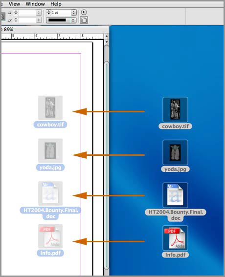
Did you know that you can drag any file ID can place normally right from an application, or the Finder? If you have a folder full of images and text, select them all and drag them to an open ID window. Wherever your mouse is when you let go, that’s where ID will start displaying the images/text (it will cascade them down the page). As you are dragging the files from the finder, you should notice a ghosted icon for each file over the ID window as you drag it around.  You can also open a MS Word file with tables in it, select it all and drag it to an open ID window – which will keep the Word Table intact & editable. (QUITE HANDY!). This tip is a great time-saver if you have a lot of images to place all contained in one folder. Once they’re in ID, you can size them and move them around normally.
Duotone support in Adobe Illustrator
Adobe brought transparency to the Illustrator world back with version 9. One of the many complaints about the poor-selling AI9 (and believe me, if you used it, you could see why nobody liked it after only 5 minutes of use!) was the inability of linked spot color EPS photos to interact with all the transparency features. In order for the Pantone colors to output correctly, you HAD to embed the photo in AI, which resulted in absolutely huge file sizes and a pretty decent wait while the file saved. If you forgot to embed the photo, AI would output it as a CMYK or RGB image, depending on what document color space you were in. Illustrator finally fixed this with version 11 (Illustrator CS). You can now link spot color EPS images into AI and not embed them – Even if you have an object with a drop shadow on top of it. This is great because you can keep a more modular workflow this way. Of course, there are very few instances where I would use a placed photo in Illustrator to begin with (at least in the advertising design business anyway). But, this is one old habit I’m happy to say I can finally break!
Does using filters in Photoshop equal bad design?
I wanted to offer a suggestion relating to the use of Photoshop filters & effects in your designs. My comments come from many years of experience in the ad business, and reflect only MY opinion and the opinion of a handful of “old-timers” I know that are also in the biz. Please take this for what it’s worth, and not as gospel. The number one thing about a design that screams “Rookie” or “Amateur” more than anything else is the (over)use of filters & effects. I remember many years ago (sometime around Photoshop 4 I guess) a filter set was released called Kai’s Power Tools. It was an absolutely incredible set of filters that did things in Photoshop that most users could only dream about with a single click of the mouse button. The “Kai syndrome,” as it came to be known, got out of control fast.
Don’t be an idiot!
Today, we have Xenofex, EyeCandy, Splat, several plug-ins from Flaming Pear and many more. These filters produce fantastic results, I have no problem with them. But just like guns, the USER is the problem, not the actual item itself. Some designers say that if the filter becomes the focal point of the design, you’re showing everyone that you have no creativity and rely on “tricks” to get attention. I’ll just say this. Use filters sparingly. Use them when appropriate, and where it really makes a difference in your design. But don’t use them simply because they’re available. A drop shadow under a photo can really enhance a design, but a drop shadow under every stinking headline, logo and phone number in an ad makes you look like an idiot. A small bevel on a web page button can look great, but giant 15 pixel bevels on every clickable link button on your site makes you look like and idiot. Don’t be an idiot – you give us all a bad name.
Edit multiple text layers in Photoshop
Many times, you have several type layers in a Photoshop document and you want to change the font, color or size for all of them. Normally you would apply the changes to each layer individually. But did you know you could do them all at once? To perform this trick, simply link all the type layers in the Layers Palette that you want to change, select one of the linked type layers to activate it, hold the Shift key down, then change the attributes you want in the Type palette (kerning, leading, font, size, color, etc…). The attributes you change on the active type layer will be carried out on all the linked text layers at the same time.
Fade the effect of your Photoshop filter
 After running a filter in Photoshop, you can reduce the amount of effect the filter produced by clicking Edit in the menu bar and select Fade…. This will bring up a dialog box which will allow you to customize the settings of the filter reduction.
The war against Spam – choose your weapon
 In the war against SPAM, one can’t have enough weapons. All modern email applications offer some sort of Spam filter. Some are better than others. Then there are dozens upon dozens of add-on applications as well. Here’s one I’ve never seen before. SpamGourmet uses the most obvious tactic to reduce the spam you receive. Read the brief description on the front page of their site.
Create a new Photoshop document with same size
If you need a new Photoshop document the same size as the one you have open, there are two ways I know of to create one without actually checking the document size dialog box. First, you can select all and copy the background layer of the open document, then Command + N for a new document. Photoshop will automatically set the size to whatever you copied to the clipboard, which in this case was the entire background layer of the open document. The second way requires a trip to a menu, but is just as easy. When you have a document already open, hit Command + N, while the new document dialog is open, click the Window Menu in the menu bar and select the open document’s name.
Extending InDesign’s pasteboard
If you’re the type that places all your images and text onto the pasteboard before you start your design/layout work in Adobe InDesign, then this tip is for you.
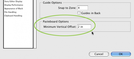
 You can expand the pasteboard space by hitting Command + K to open the Preferences dialog and select the Guides Panel. Simply change the Minimum Vertical Offset amount to the size you want your pasteboard to be and click OK. Now you have all the room you need!
