![]() Most designers know that hitting the X key switches between stroke and fill active states, and the / (slash) key fills the currently selected object with the color None in Adobe InDesign. There are a few other color-related shortcuts that, if you burn into your brain, can save you a good bit of time and mousing around on screen.
Most designers know that hitting the X key switches between stroke and fill active states, and the / (slash) key fills the currently selected object with the color None in Adobe InDesign. There are a few other color-related shortcuts that, if you burn into your brain, can save you a good bit of time and mousing around on screen.
- The , (comma) key will fill or stroke an object with whatever the current color is
- The . (period) key will fill or stroke an object with the current gradient
- The D key will fill an object with None and stroke it with black.
- Hitting Shift + X will reverse the fill and stroke colors of the currently selected object. This is by far the most useful shortcut for me, because I’m constantly applying a color to the stroke when I wanted to apply it to fill


 One unfortunate fact of using Adobe InDesign is the plethora of panels that most designers have to keep open and accessible at all times in order to be productive. It doesn’t leave a lot of space to view your document.

 You simply click the color palette on the page to select up to 10 colors at a time and the site displays a wall of image thumbnails which use a predominant amount of the color(s) you chose. While clicking a single color yields impressive results, clicking a few more colors displays a new set of thumbnails (extremely quickly) with remarkable results! I find this site to be incredibly useful, and worthy of bookmarking.
 Adding color to a grayscale image is a great effect that offers a lot of visual impact with little effort. Many digital cameras can actually do it automatically. But the results are often less than optimal. Lesa Snider at The Graphic Reporter wrote a
  One of the most difficult aspects of graphic design is color management. It’s one of those things you know you should do, but often overwhelms all but the most expert of users. Thankfully, Pantone offers ColorMunki Design, a suite of hardware/software tools for designers and digital photographers to ensure accurate color from design to output. I recently wrote a full
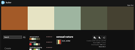
  Looking for color combinations for your next Web project? There are plenty of these Web-based color combo sites out there, with my personal favorite being Adobe’s
  Perhaps the king of color combo sites is
