Tagged: design

Use Web Fonts in your Photoshop website mock-ups

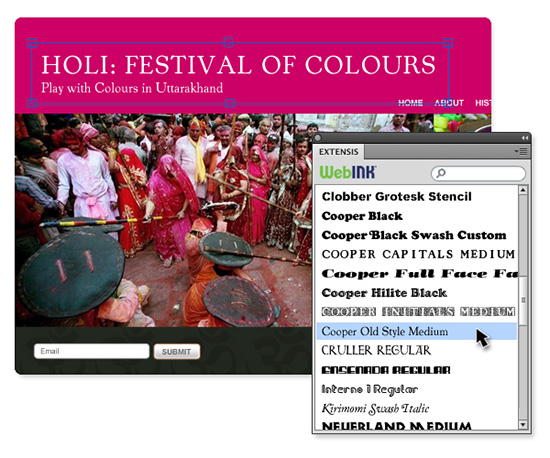
The Extensis Web Font Plug-in for Adobe Photoshop allows you to use WebINK fonts in the creation of website mock-ups in Photoshop. Extensis offers the WebINK service which allows you to easily use high-quality fonts on your website through their Suitcase Fusion font manager. The significance of this free plug-in is that you don’t have to already own or have installed the fonts during the design process.

Extensis Web Font Plug-in makes using Web Fontss in your mock-ups easy

Most of the Foundries available in the WebINK service have made their fonts available for use in the Photoshop plug-in, and more are being added. The fonts are available in an easy to use Photoshop panel after signing-in to the service right in the panel.

To use the free Web Font Plug-in, you need to download and install the Suitcase Fusion font manager demo, and set up a free WebINK account. If you already own Suitcase Fusion, you can simply update the app. If you don’t want to use the Suitcase Fusion app to manage your fonts, the plug-in will continue to work after the demo expires.

How to apply for a creative position at an ad agency or design firm

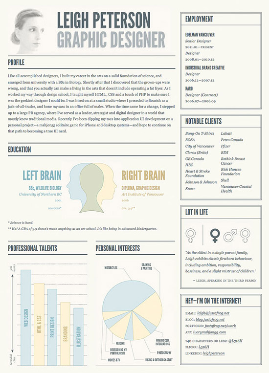
I’ve been a part of the hiring process for positions in the creative department at several ad agencies and in-house design departments over the years. I’ve seen a lot of creative resumés and portfolio books, and even more that never made the cut – but it wasn’t because they lacked talent.

The vast majority of the applicants made grave mistakes when it comes to their potential of getting hired. The bulk of the mistakes are simple, and obvious when you think about it.

Successful job interview

Selling yourself correctly results in a winning resumé and portfolio

The Resumé

Because we’re talking about a creative position, your resumé has the luxury of being creative. Take advantage of it. The first thing I do to weed-out resumés is throw away every last one that contains an “objective” paragraph on it. It’s a waste of space. I Know what your objective is, it’s to get the job we’re offering – otherwise you wouldn’t be applying for it, right? Having an objective graph on your resumé tells me you aren’t very creative, and probably used a template.

The next thing I look at is the individual job titles you’ve listed, and the type of information you’ve provided under each one. I know what an art director does, I don’t need you to list 25 typical tasks that EVERY art director does. Instead, use that space to share some successes, or out-of-the-ordinary situation you were a part of. Also consider sharing awards you’ve won in that space. (more…)

Infographic: History of design tools

History of Design Tools

Do you remember when Illustrator was released? Was it before Photoshop?

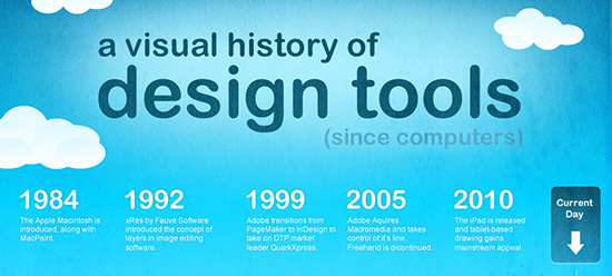
I’m a huge fan of infographics, so when I saw The History of Design Tools, I had to share it. It’s a simple chart taking a look back at the major pieces of software used in the design industry since the release of the Mac.

Rant: Design trends and techniques you should avoid – mostly because I hate them!

I had one of those weeks. You know what I mean, one where every little thing just ticks you off to no end. This week I saw numerous designs that made my stomach churn and burn to the point that I wanted to vomit profusely.

Stupid handshake

Don't use these photos. Don't tick me off. Just don't do it!

Whatever you do, don’t let me catch you doing any of the following things, or I’ll sneak into your house and delete your internets, beotch!

  • Stupid, overused, predictable, “stock photo-y” stock photos – You probably know what I’m talking about, and yet you use them anyway, right? Well friggin STOP! A bunch of ethnically-diverse yuppies dressed in 1980’s business attire doesn’t make your design look more professional. And neither does the infamous business handshake.

  • 6pt type on your website – the trend died 10 years ago. It ticks me off, probably because I’m getting older and my eyes aren’t quite what they used to be. But I’m not alone. I promise you, not matter how cool you think it looks, it doesn’t – and everyone hates you for it.
  • Screened image behind your text – In about 1989, it was kinda cool to screen a photo behind your entire ad and expect your viewer to accept that 10pt Times New Roman running across a fat guy wearing a black & gold striped shirt was eye-catching. Those people are dead now, real designers systematically killed them off while nobody was looking.
  • Dots instead of dashes – here’s another one that’s not hip, cool or even remotely unique. Putting dots between the digits in a phone number is a trend that just won’t seem to die. There’s a reason they chose (100) 867-5309 to represent a phone number. It’s easier to read than 100.867.5309. Get over it! (Thanks Frank, for bringing this up on your Facebook page!)
  • Drop shadows on everything – AlienSkin software introduced a simple plugin to add drop shadows to objects and type in Photoshop decades ago. While I love their software, I hate the way so many n00b designers abuse them. If you manage to limit yourself to using only one drop shadow on the cover of your next brochure design, for the love of God, please make sure it’s not on a white background.
  • Filter-flurry – Photoshop filters are cool, I love-em dearly. I have dozens of effects filters, hundreds of PS Styles, and a boat-load of PS Actions installed – and still only manage to use them once in a blue-moon (which I actually have an Action file to create, by the way).
  • 800×600 website design – Uh, I know you’re 800-year-old instructor in design school told you it was the “standard,” but he’s an ignorant buffoon who hasn’t worked in the business in decades. 800×600 web design was the standard when most people had a 13-15 inch CRT monitor caving-in their desktop. Today, 20-inch LCD screens are the norm, so a 960 to 1100 pixel design width is easily handled by everyone in business, right down to your granny’s crappy little $300 Dell.
  • Grey text – So you agree that 6pt type is too small, but you somehow come to the conclusion that 12pt condensed type set in 20% black is the way to go? Gimme a friggin break. Do you WANT people to read it or NOT? At least go with a 40-60% black for crying out loud.
  • Not giving the viewer what’s expected – Ok, this is a really fine line. But learn to accept the fact that if you’re selling wood deck stain or sealer, rain drops on a blue background isn’t going to frigging cut it. You’re most likely going to have to put a photo of a impossibly beautiful wood deck in a lush green backyard in the ad. Oh, and make sure you sprinkle the deck down with water first.

Those are just a few things that will surely tick me off, and most likely your viewers as well. Did I miss anything?

Humor: Truth in advertising

Truth in advertising – humorous and sad at the same time. Sad because it isn’t THAT far-fetched. Warning: a bit of foul language in this video

The Graphic Mac Link Box #2

The Graphic Mac Link BoxA collection of interesting or otherwise helpful links I’ve come across recently that you may not have seen:
Steve Ballmer’s days are numbered

Steve Ballmer, Microsoft CEO, has apparently done more to reduce the value of Microsoft than any other product, service or company. That bit of news comes to us from an in-depth opinion article by Ben Brooks.

Your next logo design: RGB vs. CMYK

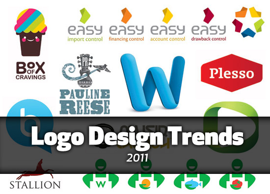
MycroBurst attempts to answer the question of what color standard you should use when designing your next logo. It isn’t a particularly in-depth article, but I felt like it was a great lead-in for a list of 9 rules for logo design I wrote a long time ago!

25 Weird interview questions from large companies

I can’t say I’ve ever been asked any of these in a job interview, but I have been asked some odd questions that were clearly intended to set me off pace for the purpose of gauging my reaction.

Text Wrap and Fit Content Options in Adobe InDesign

New users of Adobe InDesign may find this article quite helpful. It covers the ins and outs of InDesign’s Text Wrap and Fit Content Options most excellently!

How to Create Eroded Metal Text with Photoshop

Creating eroded, grungy, nasty, weathered metal text in Photoshop is probably something you do 50 times a day, right? Ok, probably not. But if you did need to, this tutorial will make it easy for you!

Apple to introduce us to Lion: Maybe you’ve heard?

Ok, so that was a smartass question. If you’ve been on Twitter, Facebook or the web in general, you’ve probably heard that Apple has a lot to announce Monday at their annual WWDC conference. Expected in the announcement are details about Apple’s MobileMe replacement, iCloud. Also expected are announcements concerning the next release of iOS 5 which will reportedly include Twitter integration and much more. As for me, I’m prepping my hard drive for a rather large (and price discounted) download of Lion from the Mac App Store!

The Graphic Mac Link Box #1

The Graphic Mac Link BoxA collection of interesting or otherwise helpful links I’ve come across recently that you may not have seen:

You can’t replace email if you require email

You can’t replace pants with shorts when your definition of shorts is: everyone buy pants and cut the legs off . That’s the premise behind this article which points out the shortcomings of current web services.

iMac (early 2011) benchmark results

Macworld published benchmarks of the new iMacs shortly after they were released, using Speedmark test results. Though they were impressive, Primate Labs released their own test results based on Geekbench testing and found the new iMacs to be even more impressive than we thought. You can also download a copy of Geekbench for free to test your current Mac and compare the results.

OS X and the death of the scrollbar

GigaOm mourns the death of the scrollbar in Mac OS X 10.7 Lion. Flipping your scrollwheel down to move up may take some getting used to when Lion ships later this summer. Thankfully Apple has offered an option to switch it back to the way Macs currently work. But is this change to the OS a sign of things to come?

Listen to Mac OS X Lion’s amazing new text-to-speech voices

MacOSXDaily has posted a few samples of the new voices that will appear in Lion when it ships. For those who live in the UK, you’ll appreciate Serena’s British accent. The quality of the voices is a huge improvement over the current Snow Leopard voices offered.

100 Principles for designing logos

Who would have thought that there were at least 100 different things to consider when building a brand? Apparently there are. I’m not sure anyone considers all of these when designing a logo, but it does give you a lot to think about, and perhaps helps guide your decision-making process.

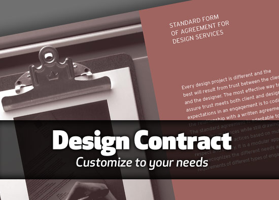
AIGA Design Contract

AIGA Design Contract

The official AIGA Design Contract - customizable to suit your needs

The AIGA Standard Form of Agreement allows you to create customized terms and conditions for different types of design engagements. The contract (PDF) is modular to meet the needs of a growing design community involved in various disciplines. You can use different portions appropriate to the scope of work you’re performing. Having a contract before you begin work can go a long way in making sure you get paid for the work you do.