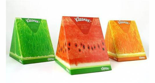
An effective packaging design can attract more customers and persuade them buy your products. Here’s a collection of package designs for your inspiration.

An effective packaging design can attract more customers and persuade them buy your products. Here’s a collection of package designs for your inspiration.
Design is about communication. It is about helping clients to realize their goals through a design solution geared toward their questions, concerns, wants, and needs.
Skeuomorphic vs. Flat design is the subject of the article, but in reading it, I found that the arguments made apply to design in general.
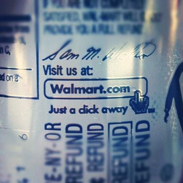
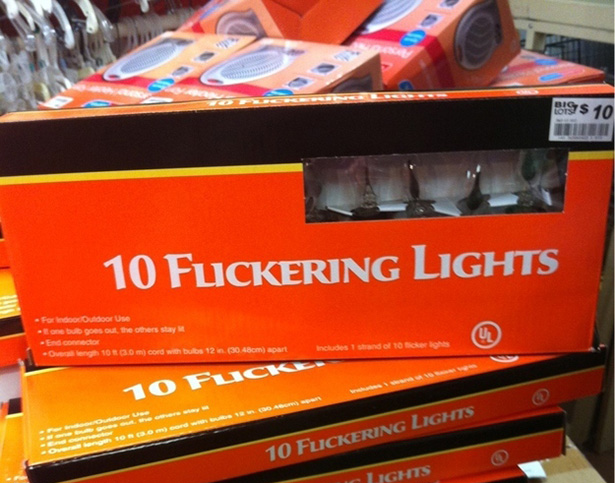
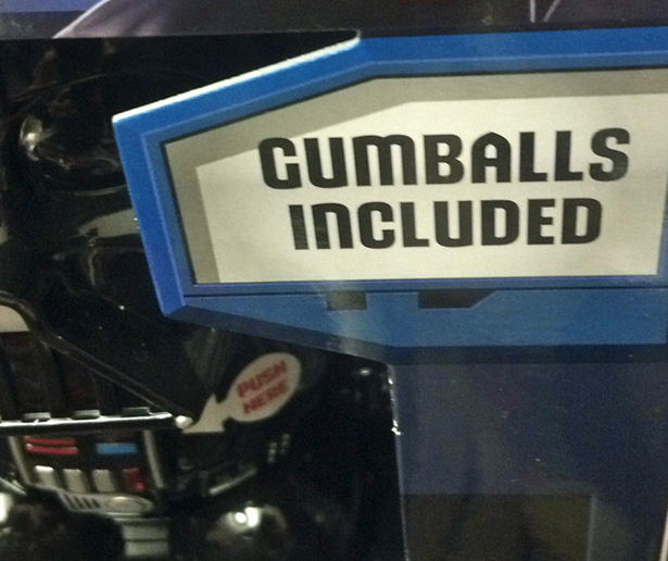
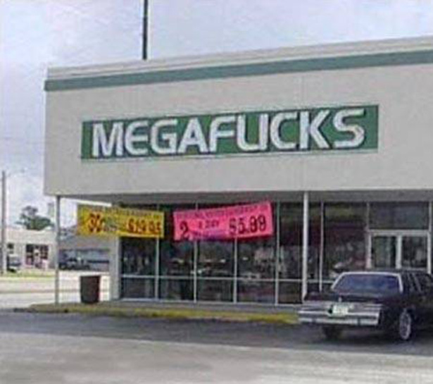
Folks, I can’t stress enough how important it is to take a good long second look at your layout. If you don’t you could end up in one of these design disaster posts.

Photoshop Etiquette is a site dedicated to offering some best practices for web designers using Adobe Photoshop. Of course, many of the tips are applicable for print designers as well.
Naming layers and using folders to group appropriate layers is a pet peeve of mine. There’s nothing worse than opening a PSD file with 75 layers all named “Layer Copy 1 Copy” and set in no particular order.
Got any tips not listed that makes life easier when using Photoshop? Share in the comments below.
Direct mail is still one of the more popular and successful methods of marketing for many companies. It puts your product or service in the hands of consumers where, hopefully, they read it and keep it on the kitchen table for a while—increasing the chance that the consumer acts on it.
With so much competition in the consumer’s mailbox, you have to design the piece for clear readability and quick communication of your message. Tell the reader too much and you risk them not reading the entire piece. Don’t tell them enough and they lose interest and toss it in the bin.
Rather than go into all the best practices of designing direct mail, I thought I would share my thoughts on a direct mail piece I received recently.
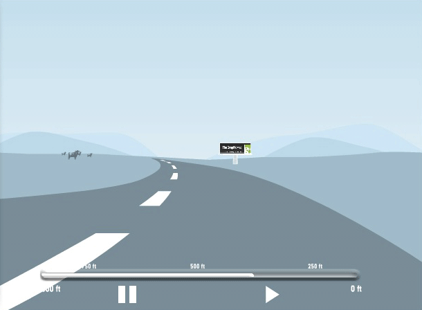
If you find yourself design billboards, you would be wise to test your design for readability. There are several ways designers have tested their work over the years, but Lamar Outdoor has by far one of the coolest (and easiest) ways to do it.
Visit the Lamar Outdoor Creative Test page. You can upload a JPG of your outdoor board (300×150 pixels at 72 dpi works best), then answer a few questions about the test view you would like to see. You can choose the type of outdoor board (bulletin, poster, bus shelter, etc.), a rough or smooth road, and the typical speed of the vehicle (20, 50 or 70MPH).
Once you click Drive, a video of what your outdoor board will look like to the driver under your parameters will be displayed in a clean, simple movie.
While not perfect, Lamar’s testing tool offers you a quick and free way to test for readability.
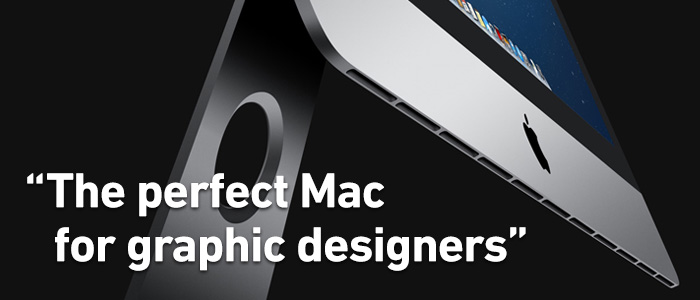
After six years of using the original Mac Pro as my main workhorse, I finally took the plunge this past Christmas and upgraded to Apple’s latest 27” iMac. It’s the first Mac I’ve owned since the Quadra 650 back in the mid 90s that wasn’t a tower model. It was a scary decision for me, but one I’ve been delighted with so far.
The first thing I had to come to grips with is the revelation that I don’t NEED all the expansion that the Mac Pro has to offer. In the distant past, the days when a 16GB stick of RAM took you a year or so to save-up for, the Mac tower models were the only way to go for pro designers. The desktop models simply weren’t made for people like us.
But times have changed. With NO exception, every Mac model available today can easily be used by the most demanding print and web designers—this includes the MacBook Air and the MacMini. If you think you NEED more, you’re most likely overestimating your needs. Today’s Macs are powerful enough for working with Gigabyte sized files with as little as 8GB of RAM.
Now I didn’t say that every Mac model is a perfect fit, far from it. And that’s where my decision got difficult. (more…)
For the love of God, PLEASE NAME YOUR LAYERS. There’s nothing worse than opening a Photoshop file with 50 layers that are named Layer 1, Layer 2, Layer 1 copy, Layer 4 copy, Layer 4 copy 2 (you get the idea). It makes it extremely difficult to work with later on; especially if that Photoshop file was created by someone else.
Name your layers in a short but descriptive manner. And don’t be afraid to group things into Layer folders. Photoshop even has a Note tool you can use (found under the Eyedropper tool). You’ll have a much easier time editing it later, and anyone else that has to work with the file will thank you.
As I looked through the analytics for The Graphic Mac over the last year it became increasingly obvious that more and more users were viewing it on iPhones and iPads. Unfortunately, the old theme of the site didn’t work as well as I had hoped on mobile devices. It was also quite cluttered in general. So I started looking for something a little cleaner to use. Today, you see the results.
The categories are listed in menus (when applicable) at the top in a desktop browser, but when you view it on a mobile device (or simply by resizing your browser window to be really thin), it places the navigation in a small drop-down style menu. The content is a lot more readable on mobile now.
The next step is deciding whether to allow comments on blog posts. I’ve had them turned off for a few years now, but I’m considering turning them back on (as I have for this post.) If I do turn them on, I won’t be using native WordPress commenting. Instead, I’ll be using either the Facebook Commenting System (like you see on many sites such as BuzzFeed), Disqus (which is used by the guys over at The Loop), or LiveFyre (which TechCrunch uses).
I’m leaning toward Disqus. It allows you to log-in using Facebook, Twitter, Google+, or a Disqus account. It also allows you to up vote or down vote comments, as well as share those comments via Twitter or Facebook.
[zilla_alert style=”green”] Ultimately, it’s up to you. I’ve turned on comments for this post, so let me know what you think below, or send me a note via the contact page (found under the About link at the top of the page). [/zilla_alert]
As you can see, the new site drops the sidebar, and reduces the lower half of the homepage to small summary-style boxes for the posts. It is my hope that the new design puts the focus squarely on the content. It’s not perfect, and I hope to fix small issues along the way, but I wanted to go live with it as soon as possible.
I hope you like the new site. And I also want to thank everyone for visiting the site for the last 10 years (starting with the original CreativeGuy blog). While the site was never designed to make me money, I do thank anyone who has ever clicked an ad (of which there is currently only one found down in the footer). It is my intention to keep the site as ad-free as possible.
I’m not sure anything needs to be said about how important the choice of which font to use is, as well as the importance of custom kerning. Below are a few photos to illustrate the point, and SmashingMagazine has a great article about How to Choose a Typeface.