Blogs

icon_ical.gifIf you have multiple calendars set up in Apple's iCal application and you receive an invite from a friend, family member or client, you can easily decide which calendar you want the invite to be placed in.

Simply hold down the Accept button, rather than just clicking on it, to get a pop-up menu which allows you to choose which iCal calendar it should be placed in.

Free daily image from Crestock

Daily Free Image from Crestock
In an effort to promote their stock photography, Crestock offers a Daily Free Stock Photo from their Web site. This isn't just a Web-sized image, these are full resolution, high-quality images you can download in a variety of sizes.

A new image is available each day, but once the new image is posted, the image from the previous day is gone forever, so you have to remember to grab it. Crestock has an RSS Feed for the free images to show you which image they're giving away each day, or you can just add it to your start tabs in your Web browser.

All you need to do is register with Crestock to download these images. I've been downloading these images for quite some time, and have used several of them for print projects, as well as this site.

I like Crestock because the images they provide seem to be more colorful and creatively shot than many stock photo suppliers. They're one of the first places I search at when I need an image for a client project.

Free paint splatter texture

res_free-paint-splatter-texture.jpg
Bittbox has posted the latest Free Texture Tuesday offering. Paint Splatters, a group of high resolution textures available for download now.

You can grab textures from all over the Web, but Bittbox consistently offers very nice textures, which are high resolution enough to use in most all print work. In particular, I like the black-only paint texture (the last preview image on the page) in this weeks download. Don't forget to check back at Bittbox each Tuesday for a new set of textures.

Linotype has finally released the long-awaited update to it's free font manager FontExplorer X - a favorite among designers everywhere as an alternative to Suitcase Fusion and FontAgent Pro. The features are rich, unfortunately, so is the price.

icon_fontexplorerx.pngFontExplorer X Pro now comes in two flavors, a desktop client and a server version. The desktop client now sells for $39 until February 28th. On March 1, 2009, the app will jump to $79. The server version price is based on the number of seats that you require it to serve.

FontExplorer X Pro supports Adobe InDesign, Photoshop and Illustrator CS2, CS3 and CS4, as well as Quark XPress versions 6.5 through 8.x, and features auto updater, the ability to clear system and application level font caches, smart sets, application-based sets, font previewing, Spotlight support, conflict resolution, backup support, and of course a built-in online font store.

A demo of FontExplorer X Pro is available and runs on Mac OSX 10.4.x through 10.5.x. I have not tested the application yet, but will be in the near future.

The arrow keys in Adobe InDesign are more useful than for just moving the text cursor through lines of text. Use the arrow keys while drawing a polygon with the shape tool to add or subtract sides on the polygon, and adjust the inset value of the polygon on the fly.

It's simple to do, just start drawing your polygon, then hit the up or down arrows to add or subtract the number of sides, and the left or right arrow keys to increase or decrease the inset value.

As you can see on the video at the upper right, sides are added quickly and easily, on the fly, so you can see just what the polygon will look like before you finish drawing it. This makes it so much easier to draw the perfect starburst in your ads - because I know your New Year's Resolution was to draw more starbursts in your ads... right?

Rant: Logo-Instant, free Web 2.0 logos

Logo-Instant

Design contests, it's a hot topic in the design community. Most designers frown upon these online design contest sites where designers compete against each other designing logos, ads and Web sites for the chance to win a few hundred bucks.

For the record, I have no problem with these design contests. It sharpens your skills and provides the opportunity to earn some extra cash in these tough times. If you're willing to put in the work for a chance at winning a small fee, so be it. In my opinion, it's not only not worth the money, but it really belittles the skills of designers everywhere. We're not talking about spec-work for a potential big client. No, this is just some stranger on the Web looking for the cheapest, fastest work - basically preying on junior designers.

But the other day, I came across a site that made my stomach turn.

Most searched-for terms of 2008

Google has published their year-end Zeitgeist for 2008. After a whirlwind year of election news, economy woes, and the lead-up to the showstopping Summer Games in Beijing, Google looked back to see what was on the minds of Americans through it all. One thing's for sure: it was a wild ride.

Google - Fastest Rising (U.S.):
"Fastest rising" means Google looked at the most popular searches conducted for 11 months of 2008 and ranked them based on how much their frequency increased compared to 2007.
web_google-zeit08.jpg

  1. Obama
  2. Facebook
  3. ATT
  4. iPhone
  5. YouTube
  6. Fox News
  7. Palin
  8. Beijing 2008
  9. David Cook
  10. surf the channel

The Zeitgeist also lists the most searched-for terms in categories such as news, books, images, politics, showbiz, sports, and more. If you don't live in the U.S., you can also choose to view the World-wide results as well.

YahooBuzz! - Most searched:
In comparison, Yahoo Buzz! lists their top 10 searches of 2008 on Yahoo.com a little differently - well, a LOT differently:
web_yahoo-buzz.jpg

  1. Britney Spears
  2. WWE
  3. Barack Obama
  4. Miley Cyrus
  5. RuneScape
  6. Jessica Alba
  7. Naruto
  8. Lindsay Lohan
  9. Angelina Jolie
  10. American Idol

I don't want to categorize people, nor do I care which search-engine you choose to use. But I think the results clearly show the type of people are using Google vs. Yahoo for their search needs.

It's fairly clear to see why Yahoo is in such bad shape, at least for me anyway. The type of people searching for Lindsay Lohan, Britney Spears and WWE wrestling just aren't the type of people a company targets for their advertising, for the most part. In addition, Google's Web-based tools such as Google Docs, Reader, Gmail and the plethora of other apps just make it so easy to set iGoogle as your home page and not bother to look elsewhere for your search needs.

Inspiration: 40 playful logos

gen_logos-playful.pngLooking for a little logo design inspiration? Feeling whimsical? KreativeGarden has posted 40 playful logos to spark your inner genius.

We all need a little pick-me-up once in a while when we hit a creative wall. Toss out the idea that looking to other designers work for creative ideas is "copying" their work. It's simple stimulation. Looking at other work gets your brain moving in the right direction. They don't publish C.A. simply as an ego-booster. Most designers flip through the latest C.A. any time they're searching for a little extra creative boost to get their project under-way.

Maybe playful logos aren't you're thing. Take a look at a similar post at KreativeGarden for 40 colorful logos.

Like every year, 2008 also witnessed redesigned versions of many company logos; some were for the better while some turned out to be hopeless. You all will agree that “A redesign can be worth, if you get it right”, after all, a logo is the most important part of any corporate identity.
BestBuy logo
Therefore, with the year 2008 ending, Graphic Design Blog takes the opportunity to bring up some of the major redesigns of the year. As always there were winners and losers, but I want you all to share your opinions telling which redesign you think made up till the mark.

Here
are some of the major re-designs of the year.

Get the most out of your laptop battery

osx_system-profiler.pngIf you know the right tricks, you can maximise the lifespan and battery life of you MacBook or MacBook Pro. The way you charge the battery, the conditions is which you use and store your laptop and the way you have your energy saver preferences set all have an effect on how long your battery will last and how well if performs. The OSX System Profiler can help you assess the condition of your battery's current health.
MacOSXTips recently published Get the most out of your laptop battery, which covers some best-practices for maintaining a healthy battery life on your MacBook and MacBook Pro.

My recommendations are to power-off your laptop overnight, cycle the battery completely each time you use it - which means to run the laptop on battery power until it's down to at least 20% charge before you plug it in to recharge, and make sure you have the battery optimization set to "Better Battery Life" in the Energy Saver system prefs pane. And if you plan on not using the laptop for a few days, such as a vacation or long weekend, take the battery out of the laptop completely after powering it off.

The laptop battery only has so many recharge cycles in its life, recharging the battery when it's still at 80% needlessly uses up a cycle, thereby shortening the life of the battery. Using the tips provided in the article will go a long way in prolonging your investment.

Adding a snowstorm effect to your Web site

You may have noticed a lot of Web sites this past month which feature animated snowflakes falling down the page in the background. Pretty nifty for the winter months and holiday season. It's a fairly simply Javascript effect which you can customize quite a bit. You can learn more about the Snowstorm Javascript Effect here.

The downloadable Snowstorm Javascript allows you to have the falling snowflakes collect at the bottom of your browser window, adjust the speed of the falling flakes, and even follow your mouse as you move it across the page (wind effect) if you wish.

Note: Just for fun, move your mouse over the blinking Christmas lights at the top of the page for a cool effect.

When you place an image in Adobe InDesign, then scale the image, you are in effect altering the resolution of the file.

Reducing the image increases the resolution, thus making the file size larger than it needs to be and possibly resulting in a blurry image when printed. Increasing the size of the placed image can result in jaggy images when printed.

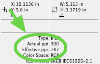
id_info-panel-resolution.pngTo quickly check the resolution of your placed, and subsequently scaled, images once they're in Adobe InDesign, select your image and hit F8 (which will open the Info panel).

From there InDesign will inform you of the actual resolution of the placed image, as well as the resulting resolution after you've scaled it. As you can see in the screenshot at the right, I placed a 300ppi image into my document and scaled it down by more than half. The resulting image will have an effective resolution of 787ppi when printed - much more resolution than is necessary for offset printing.

Not a big deal in most cases, but if you're placing many large images in your document and scaling them all down really small, your document size is going to be huge, thus making the program run slower and the printed result less than optimal.

16 Digital photography tips for Christmas

pho_xmas-photos.jpgPhoto by krisdecurtis.

DigitalPhotographySchool has a last-minute set of tips for shooting Christmas photos worth checking out before you set out for the family get-together this year.

Select & delete all guides at once in Adobe InDesign

InDesignIf you've ever received an Adobe InDesign file from another designer or client that you need to work on, and upon opening found the document pages absolutely covered with useless Guides (Don't you just hate that?), this little tip will ease your pain, and clear the document of unsightly and largely unnecessary guides.

Rather than deleting guides one at a time, hit Command + Option + G then Delete. This selects all the guides on the page and deletes them.

If you find the guides locked into position, hit Command + Option + ; to unlock them before selecting and deleting them.

See exact time in iTunes playlist status bar

By default, iTunes displays the approximate playing time of the selected playlist in the bottom status bar - along with the number of songs and file size of the list of songs (See image below).

osx_itunes-time-1.png

This is fine most of the time. But what about when you're trying to find the perfect combination of songs to use as a soundtrack for your home movie, etc.? How long exactly is 5.9 hours?

osx_itunes-time-2.png

Click the info in the status bar with your mouse and the status display switches from relative to exact time (as seen above).

Thanks to Tips4Mac for the helpful hint.