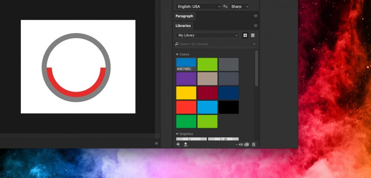
Post Tagged with: "color"

The psychology of color

The psychology of color

Color Psychology

There's a reason restaurants use red

Ever wonder why so many restaurants use so much red in their color palette? Have you noticed that the corporate colors of so many large companies includes blue? There’s a reason. This excellent infographic after the jump sheds some light on the subject.

01/27/2012 Read More
The forbidden colors

The forbidden colors

Hidden colors

The eye can't see certain colors. Or can they?

Try to imagine reddish green — not the dull brown you get when you mix the two pigments together, but rather a color that is somewhat like red and somewhat like green. Or, instead, try to picture yellowish blue — not green, but a hue similar to both yellow and blue.

Is your mind drawing a blank? These colors exist, but you most likely can’t see them. These “forbidden colors” are the subject of this interesting article by Natalie Wolchover over at Life’s Little Mysteries.

01/25/2012
Save space and never open the InDesign Swatches panel again

Save space and never open the InDesign Swatches panel again

InDesign Swatches panel via Control panelOne unfortunate fact of using Adobe InDesign is the plethora of panels that most designers have to keep open and accessible at all times in order to be productive. It doesn’t leave a lot of space to view your document.

Fortunately, InDesign CS5‘s Control panel includes a full version of the color Swatches panel, so you can save yourself some screen real estate by using it instead of keeping the Swatches panel open on the screen at all times. The bonus of using the Swatches panel this way is that it scoots out of the way automatically when you’re done applying a color swatch to a fill or stroke to your object or text. You also have access to the Swatches panel fly-out menu.

11/18/2011
Turn off the color sampling ring in Adobe Photoshop CS5

Turn off the color sampling ring in Adobe Photoshop CS5

You may have noticed something new when selecting colors with the eyedropper tool in Photoshop CS5. It’s called the color sampling ring, and it shows you the previously chosen color, as well as the one you’re clicking on in a ring around your cursor. This can be particularly useful if you’re trying to compare colors.

Color sampling ring

Photoshop's color sampling ring in action

However, if you simply don’t like the screen clutter you can turn it off. Just select the eyedropper tool and take a look up in the Control Panel at the top of the screen. You’ll see a checkbox for “Show Sampling Ring” which you can uncheck to make it go away forever.

08/19/2010 Read More
Working with color in Adobe InDesign

Working with color in Adobe InDesign

Working with color in Adobe InDesign

Working with color in Adobe InDesign

Callum Chapman has posted a great article on working with color in Adobe InDesign over at spyrestudios. This article is great for designers just getting started or still in school, and covers topics such as:

  • Printing Requirements
  • Color Models: RGB vs CMYK
  • Adding Colors to the Swatches Panel
  • Applying Colors to Objects
  • Creating Strokes
  • Creating and Applying Gradients to Objects
  • Creating a Spot Color

Definitely worth a read. And be sure to check out the rest of the site, because it has some great stuff covering a variety of topics!

08/04/2010 Read More
Search for images by color

Search for images by color

idée inc. has a fantastic image-search tool that looks through over 10 million Creative Commons images on Flickr based on the color of your choosing. Search web images by color You simply click the color palette on the page to select up to 10 colors at a time and the site displays a wall of image thumbnails which use a predominant amount of the color(s) you chose. While clicking a single color yields impressive results, clicking a few more colors displays a new set of thumbnails (extremely quickly) with remarkable results! I find this site to be incredibly useful, and worthy of bookmarking.

09/29/2009 Read More
Painting color onto a grayscale image

Painting color onto a grayscale image

Adding color to a grayscale image is a great effect that offers a lot of visual impact with little effort. Many digital cameras can actually do it automatically. But the results are often less than optimal. Lesa Snider at The Graphic Reporter wrote a brief tutorial a few years ago that illustrates this simple technique that creates a central point of interest in your image. The tutorial involves the use of layers and layer blending modes, as well as the brush tool. Once you master the effect doing it as described in the tutorial, you can move on to using Masks and Channels for more accurate results. One bit of advice though, less is more. In other words, pick and choose the areas of your image you want to draw attention to the most. Colorizing most of the image defeats the purpose of the effect entirely. In the sample image above, I probably would have left the hat, gloves and purse in grayscale, drawing more attention to the purse. But that’s just my opinion.

01/19/2009 Read More
Quick and easy color management with Pantone ColorMunki

Quick and easy color management with Pantone ColorMunki

One of the most difficult aspects of graphic design is color management. It’s one of those things you know you should do, but often overwhelms all but the most expert of users. Thankfully, Pantone offers ColorMunki Design, a suite of hardware/software tools for designers and digital photographers to ensure accurate color from design to output. I recently wrote a full review of Pantone ColorMunki for Macworld, where I found that ColorMunki not only makes color calibration of your display and printer easy, but capturing colors from any substrate you can think of a snap!

12/09/2008 Read More